Process
What we did overthe duration of the project.
Initial AI Images
from Hugging Face
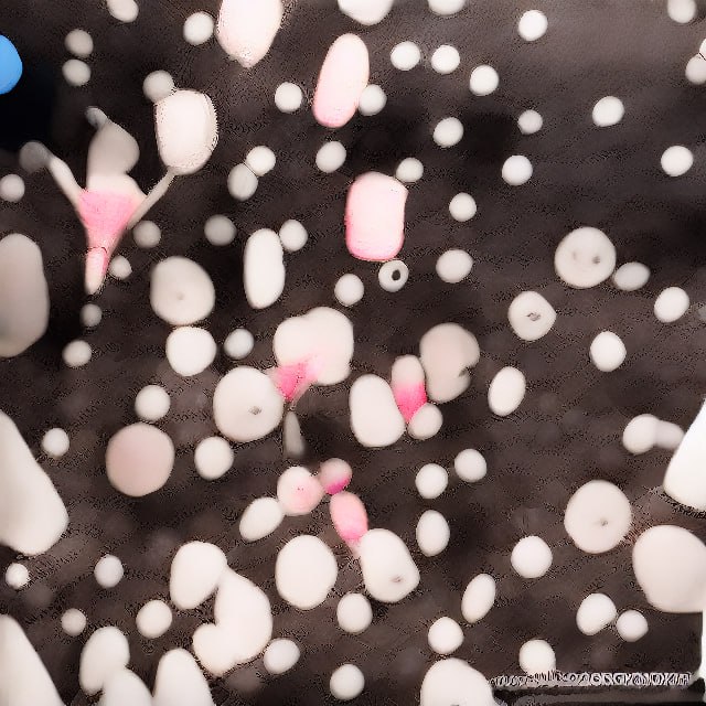
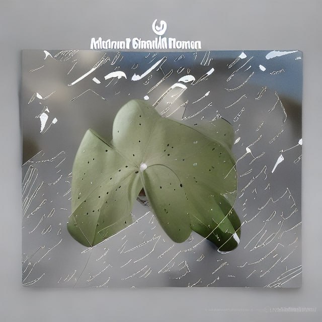
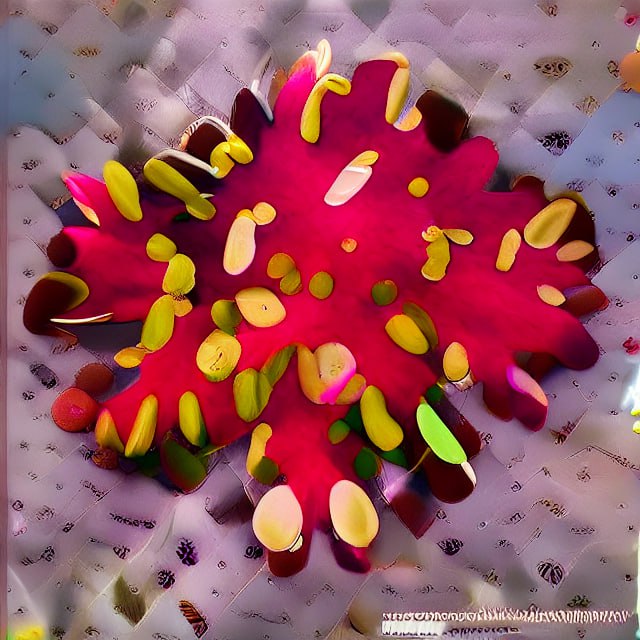
Early stages in our initial project direction saw us trying out various AI generator sites, one of which being Hugging Face, to combine both our flower images and descriptive text prompt drawing upon their characteristics to produce an abstract outcome.
Though our text prompts were more strict in listing each personality trait of the flowers, the addition of our own words to generate more ideal results didn’t pan out the way we’d have liked as the AI we used wasn’t as capable in creating the style we were really looking for.
Projection idea images
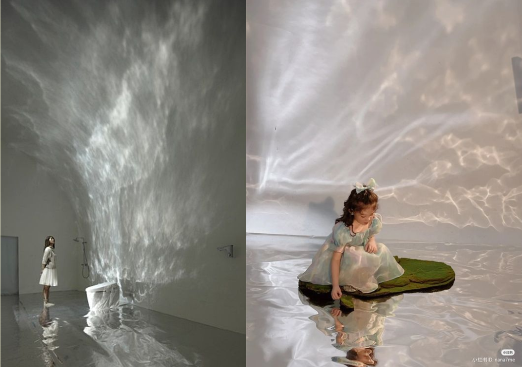
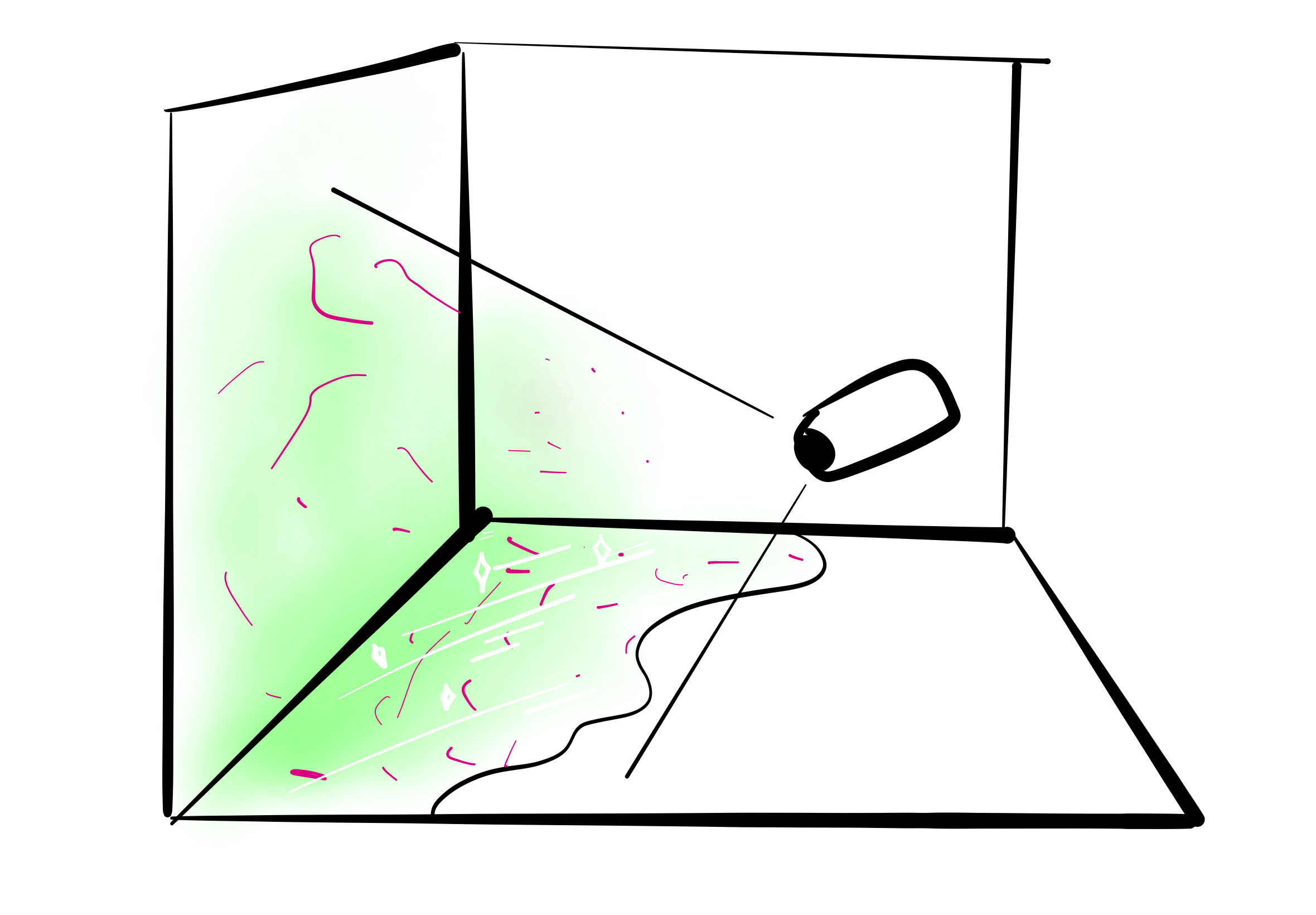
Our second step in our plan was to use these abstract flower images in casting projections within the space of a room, curating an audience’s experience as though stepping through an otherworldly dimension.
We explored the possibilities of different materiality of reflective surfaces, translucent cloths and fabrics, hanging bottles, water, and LED lights that could help us in our projection.
Finding a suitable AI generators
We eventually moved away from our first art direction partly due to the superficiality of our artefact outcome in responding to our goal in having audiences bond with nature. The other underlying factor for change was the process and outcome of our text prompts that spoke of the need to source an AI generator with an art style that toed the line of being just abstract enough while allowing viewers to input their own thoughts when looking at these images.
While remaining on the topic of nature and the use of text prompt for our brief, our renewed direction led us to create reimagined spaces as inspired by nature elements, in particular, the same flowers we analysed before, while expanding towards those beyond our findings. Solely working with the aspect of text prompt this time, we did away with combining it with our images as we felt that it affected the way AI came up with visuals.
Craiyon was one that was, though might not be as advanced in creating realistic images like more well-known ones could, able to produce an art style we favoured. We were more selective with the personality traits of flowers in our prompt input, as well as including more creative and imaginative phrases that could help AI in generating fantastical, dreamlike worlds or spaces that deviated as far away as it could from reality.
Data Collected
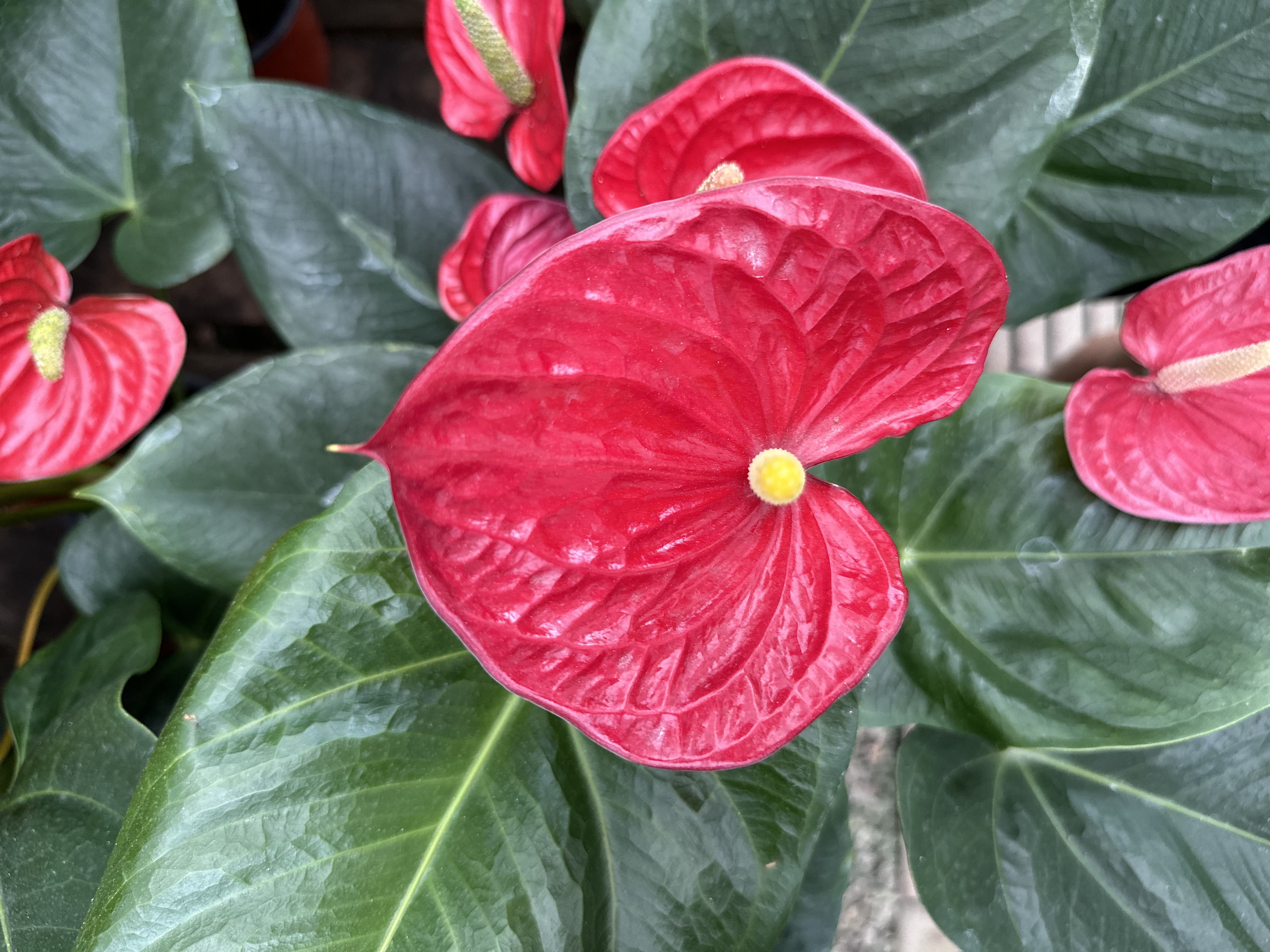
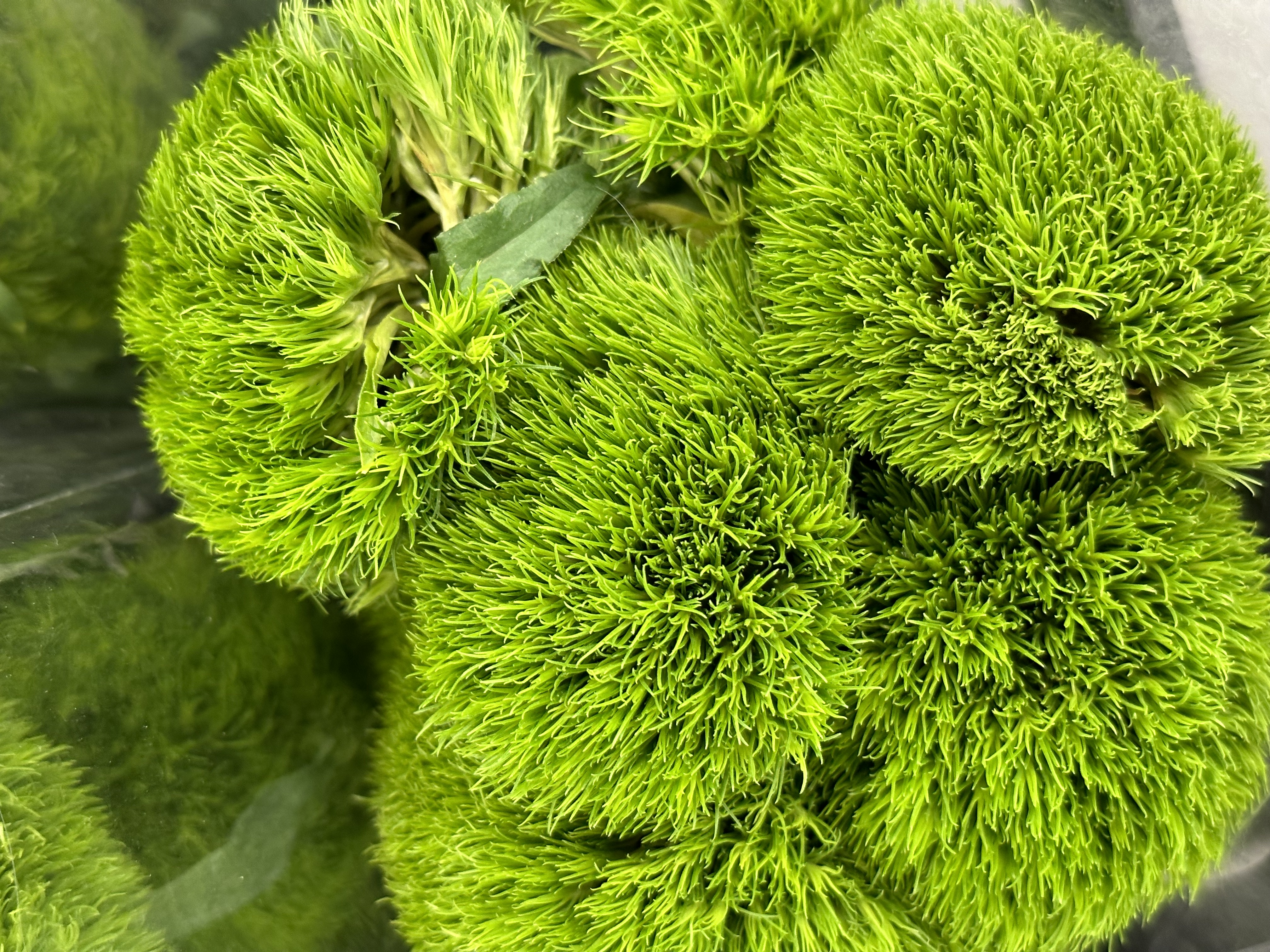
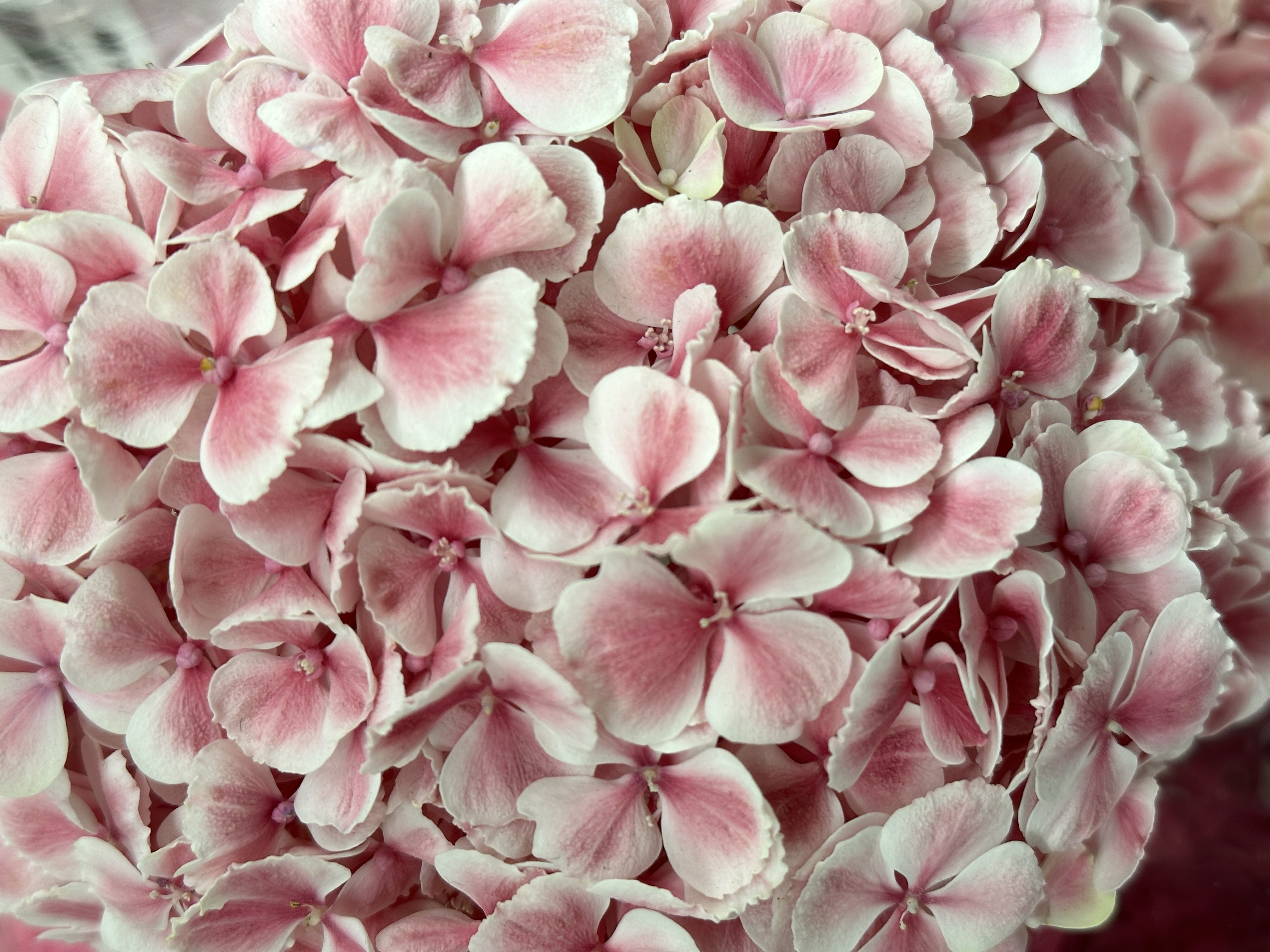
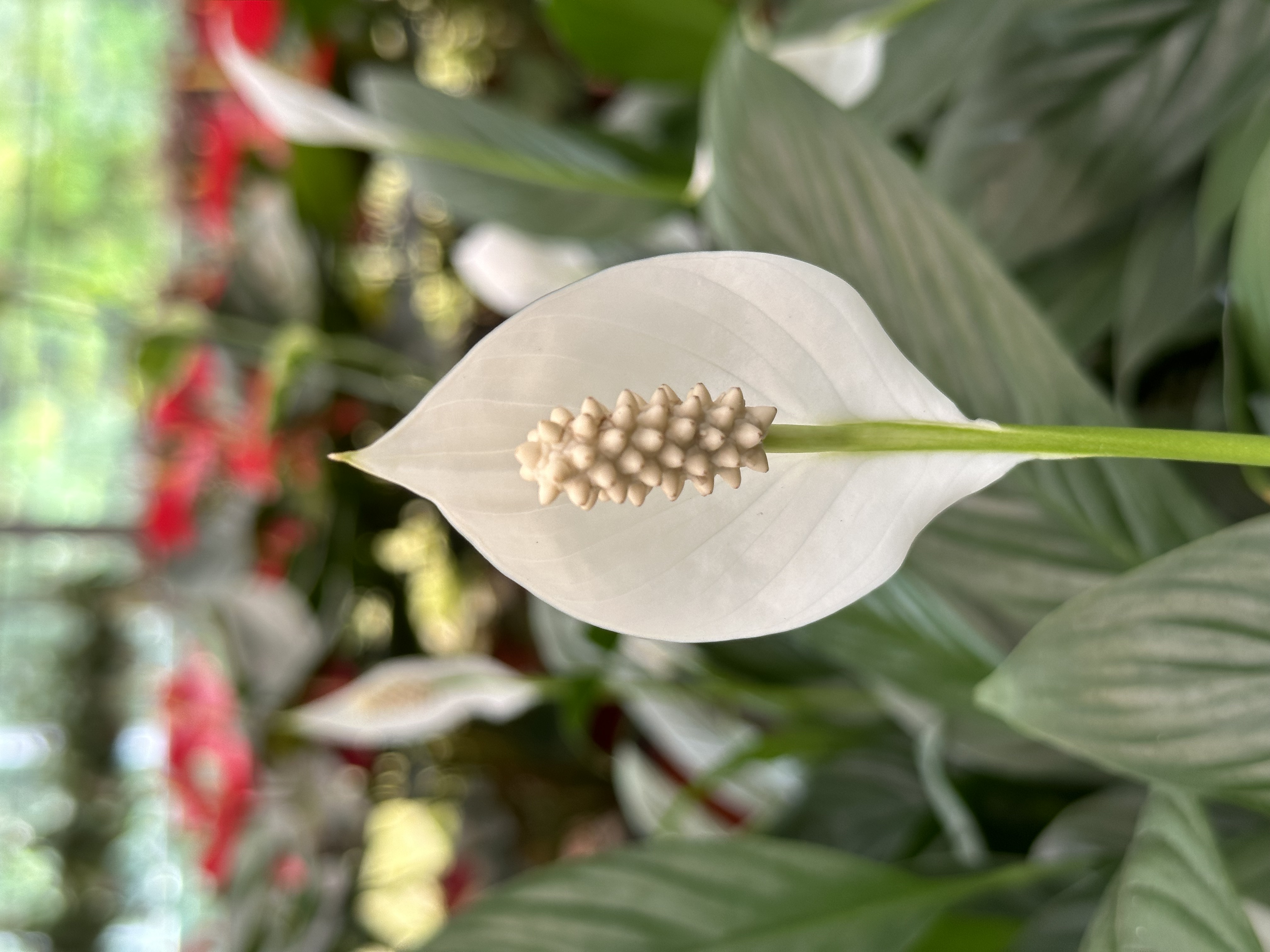
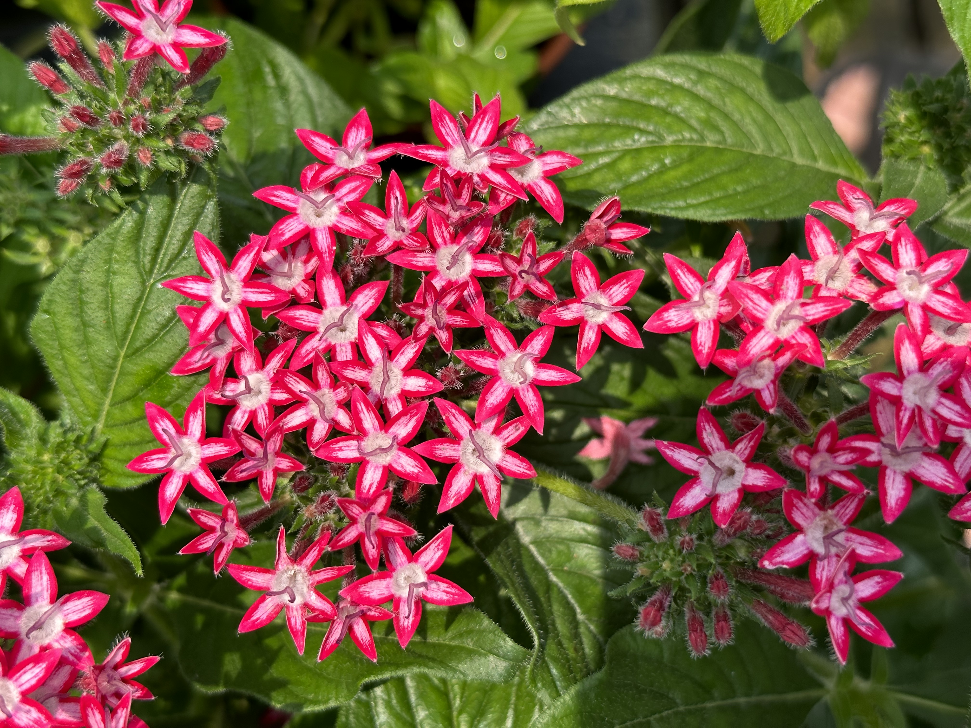
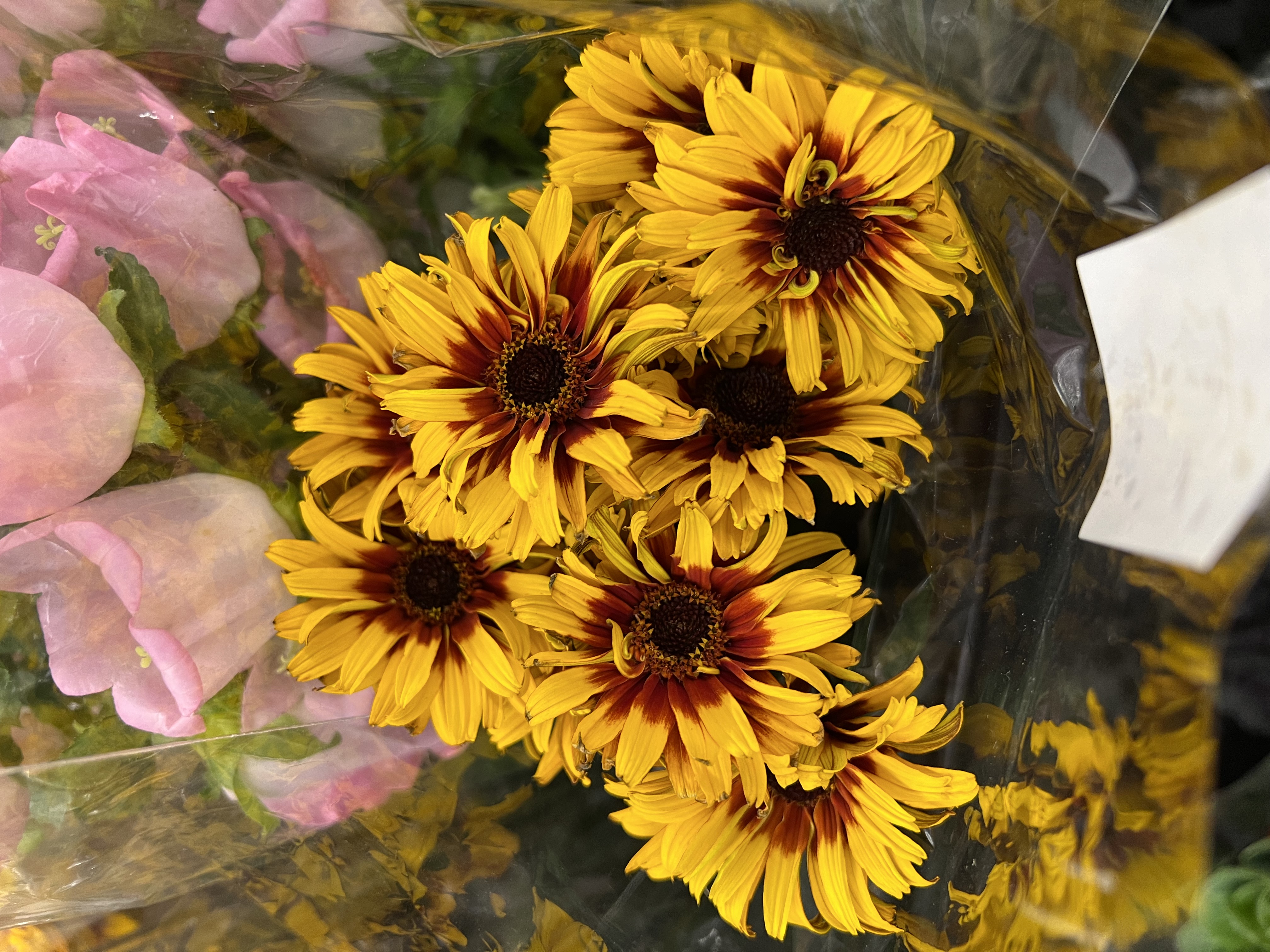
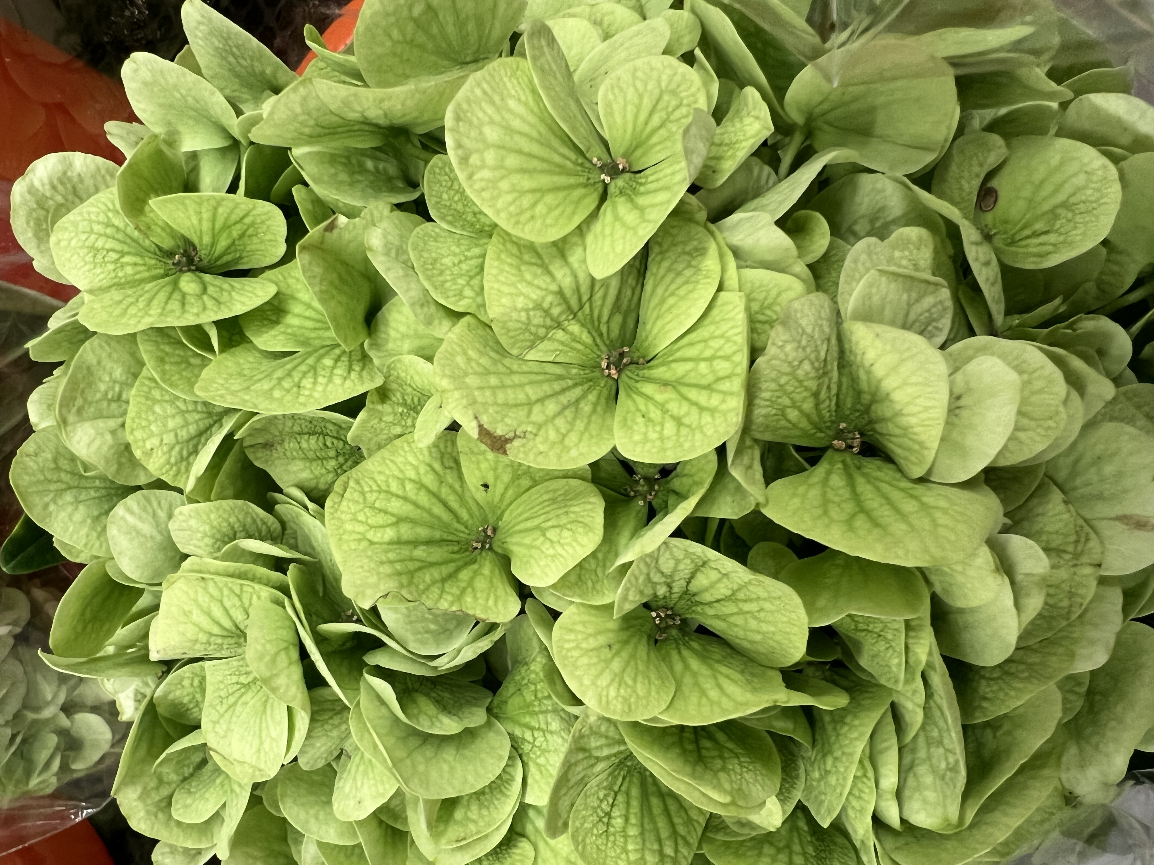
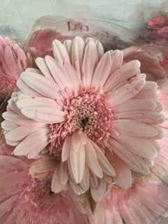
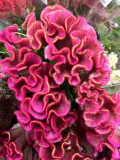
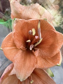
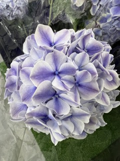
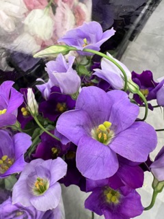
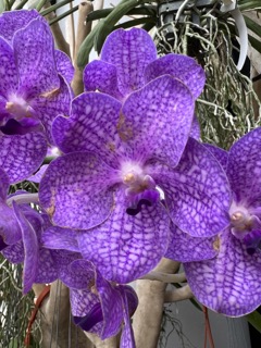
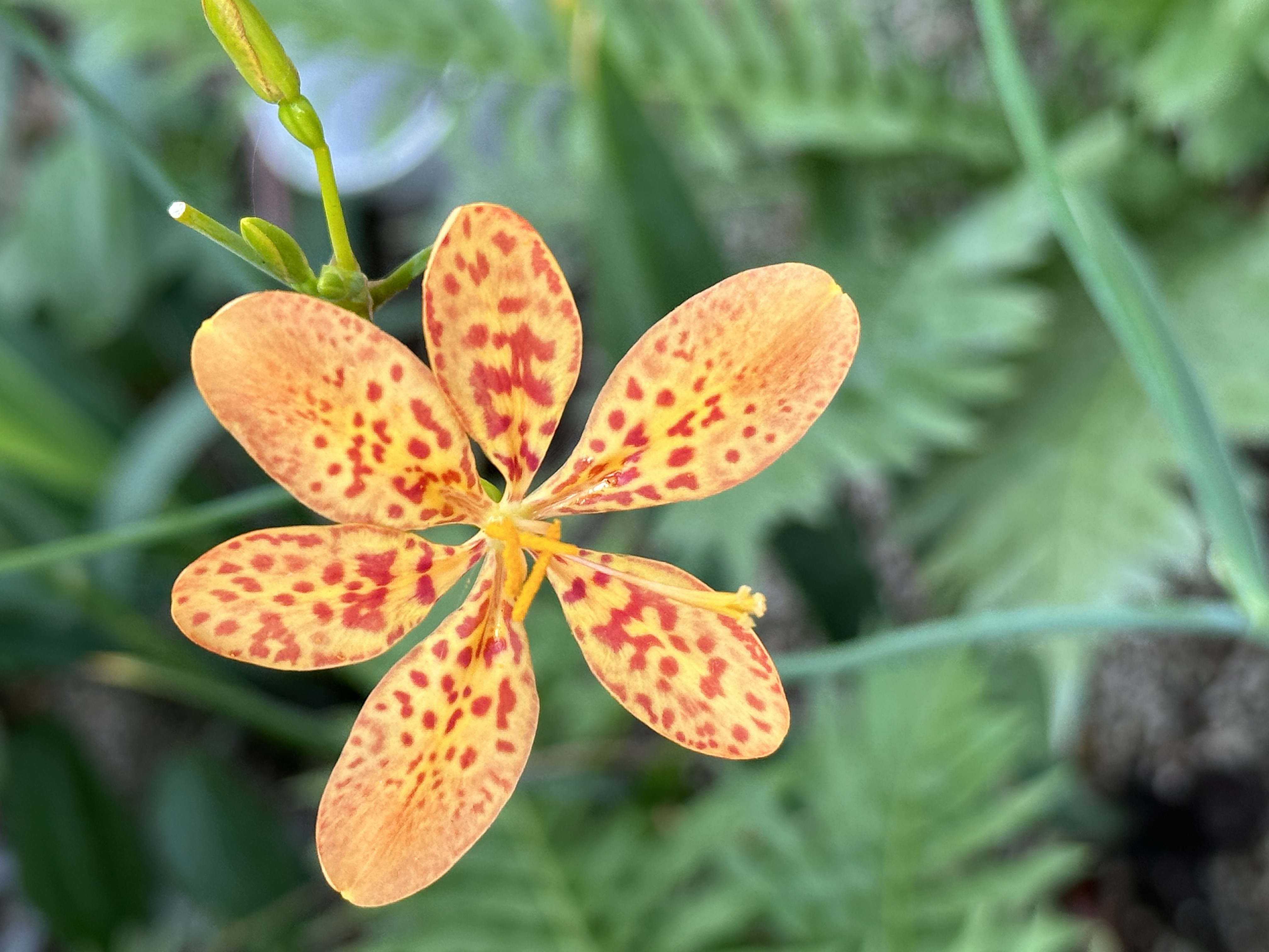
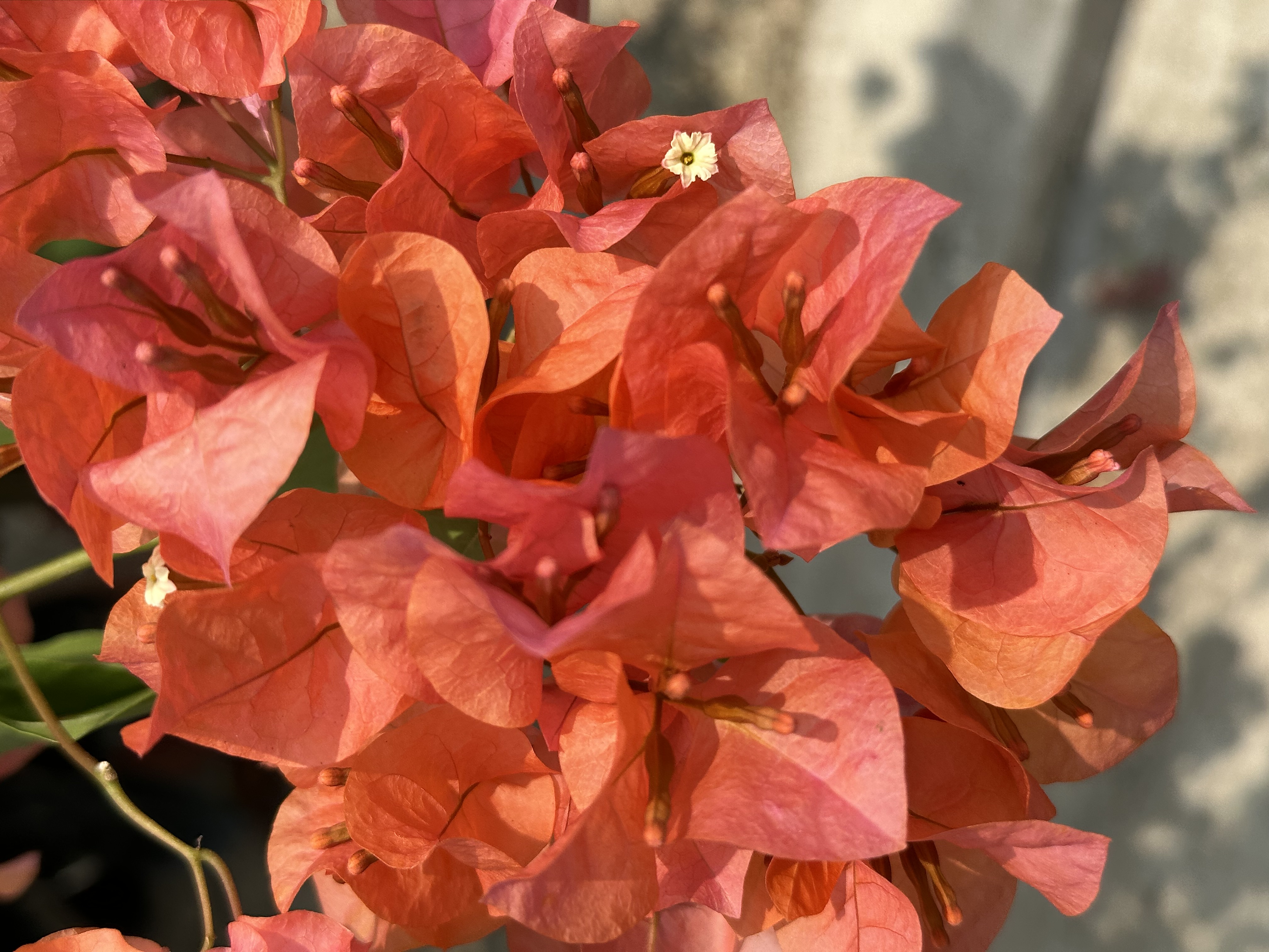
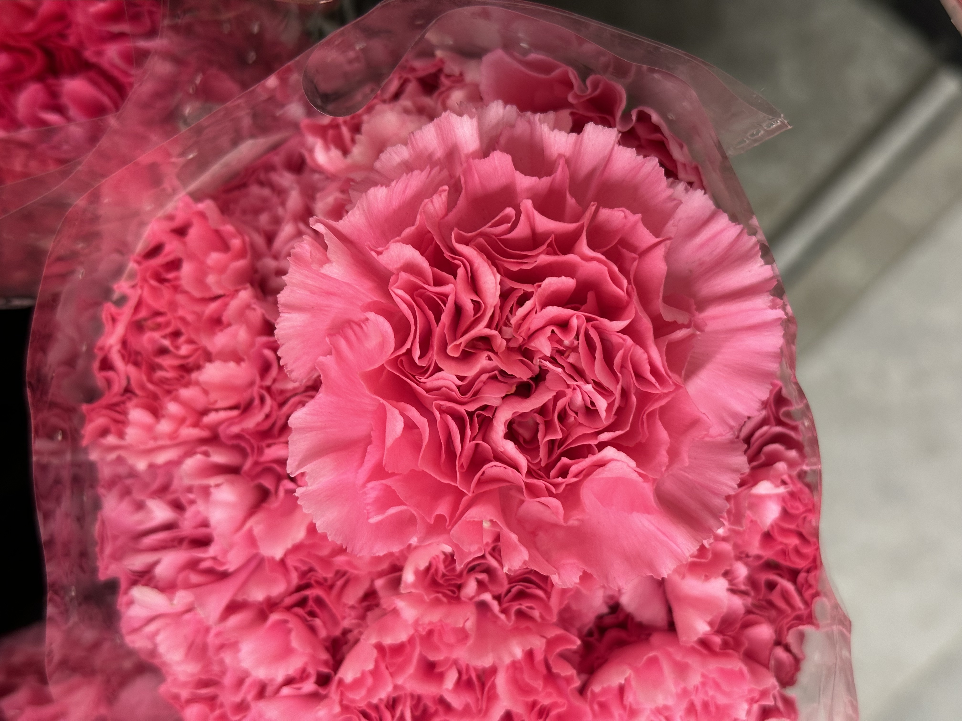
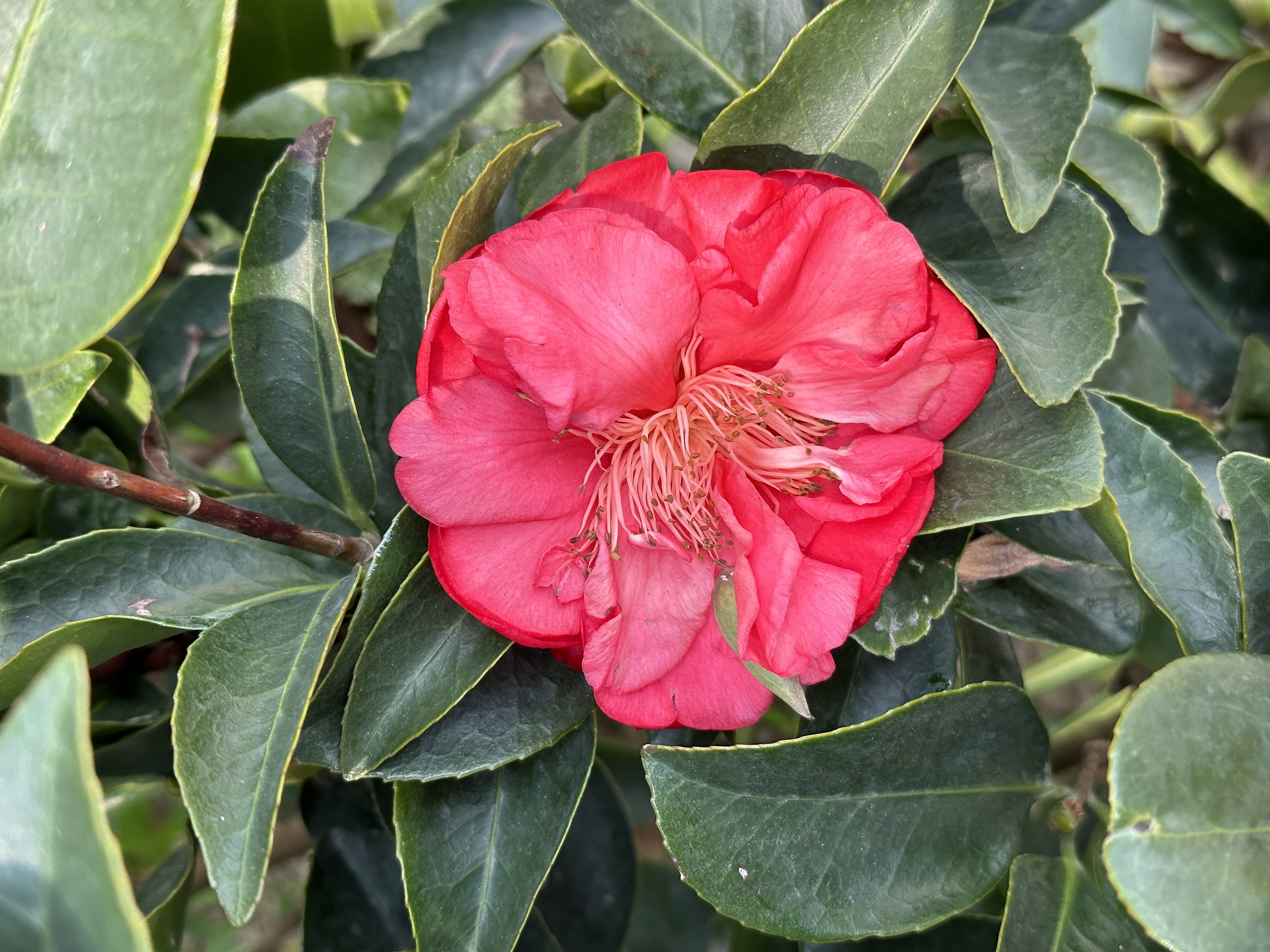
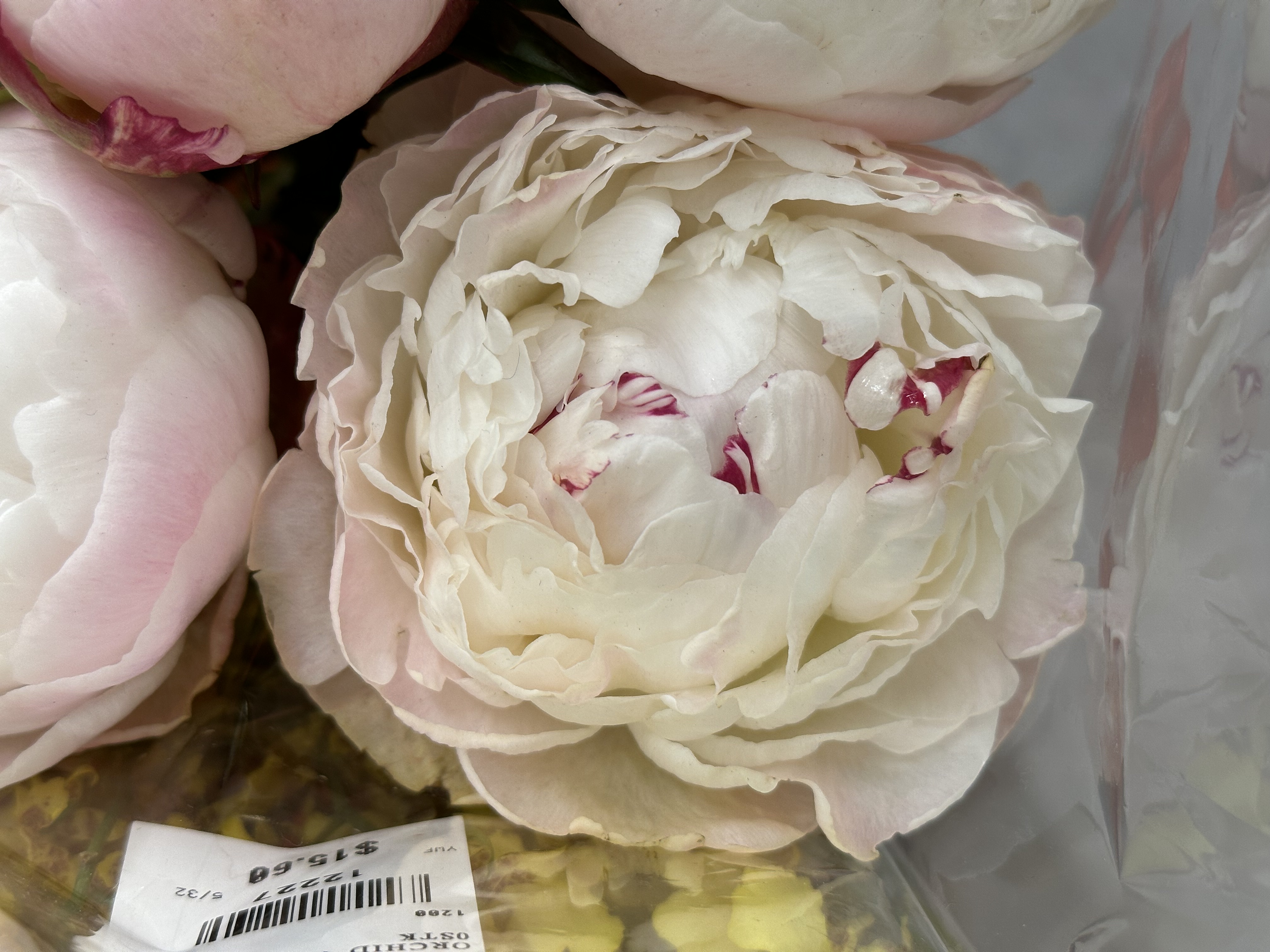
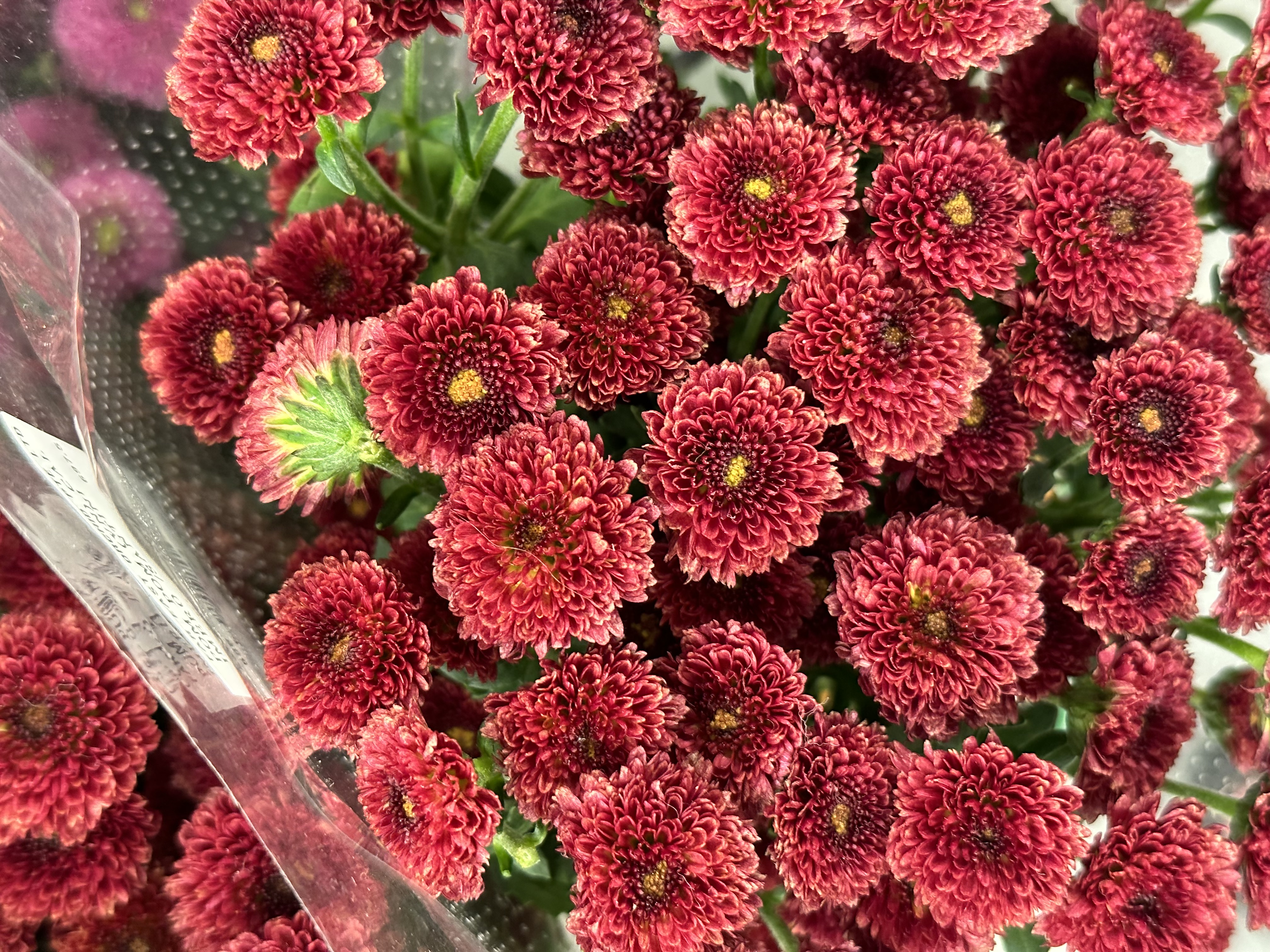
Data gathered from flowers based on their characteristics of symbolism, colour, texture and smell are used to describe a room or visualise space in our text prompts.
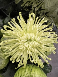
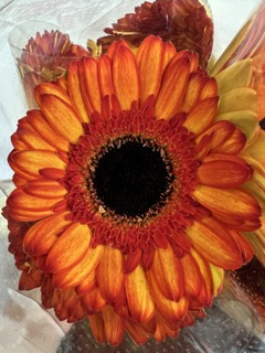
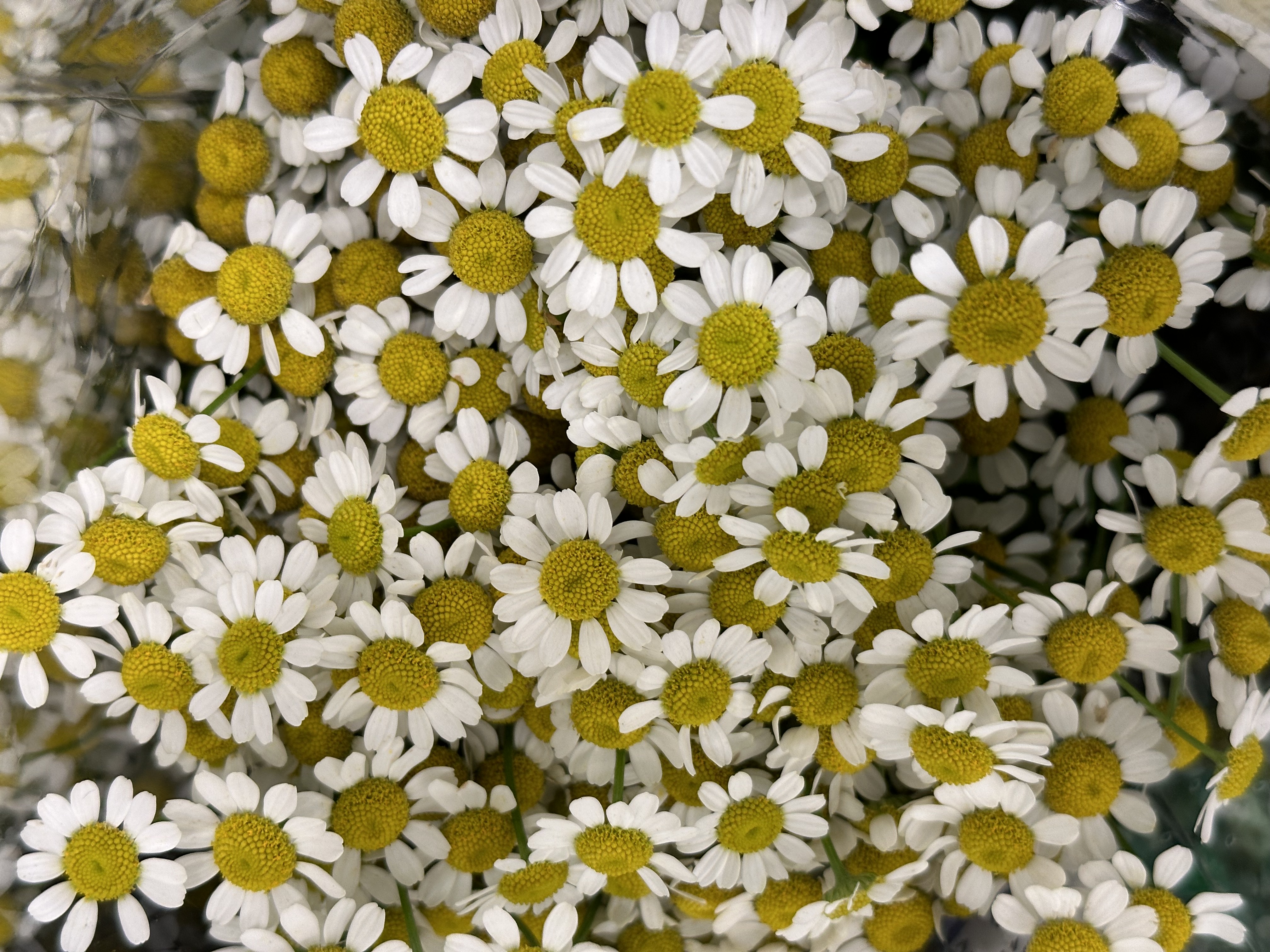
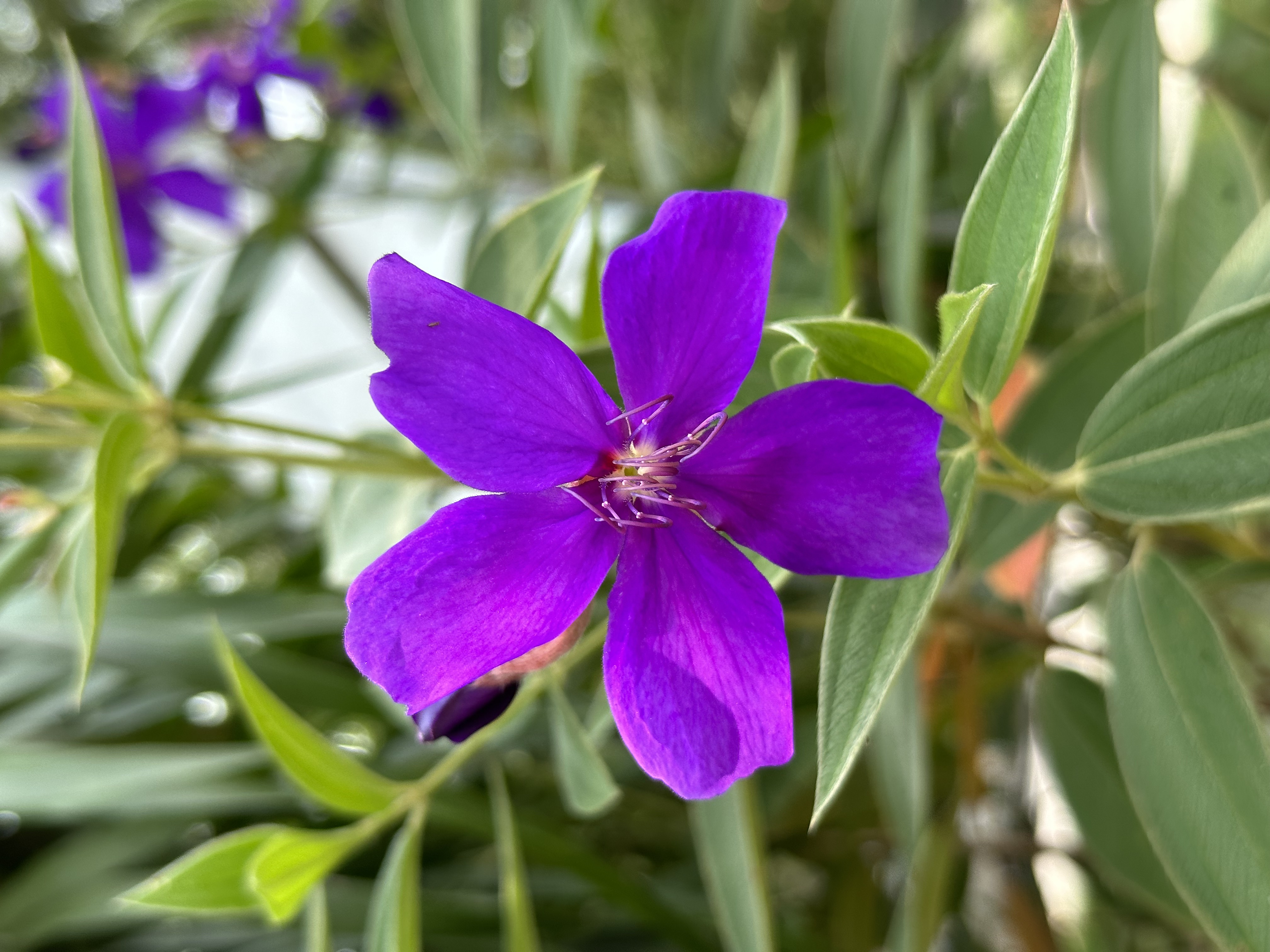
These flowers, initially analysed from our trip to nurseries around Singapore, are expanded beyond those we’ve found so as to broaden our scope. Our choice in focusing on floral elements within nature also comes from our observations that the variety of flowers offers a diverse range of data for us to collect and work on as compared to plants or trees.
An example of incorporating data collection into a text prompt with a predefined structure:
DIANTHUS GREEN TRICK
Symbolism: love, affection, gratitude, admiration
Color: green - rebirth and renewal, health, fortune, youthfulness.
Texture: spiky - loud
Smell: spicy fragrance
Text prompt: A lively, positive-atmosphere, youthful, abstract, magical, fantastical, surrealistic green room inspired by the Dianthus green trick.
Artefact
Our publication series ‘Flora Fantasia: Last Night’s Dream Was’ collates selected images into a collection of colours symbolic of the moods and emotions they portray, through which viewers are able to choose in whichever order they may want to view the images according to how they feel. Though these images may work just as well presented on-screen, by having our artefact in a printed format, we hope to encourage viewers to cultivate a sense of appreciation for the physicality of things; the act of touching, feeling, interacting, and in collecting that we may be reminded that print has its own place even in an ever-digitised world.
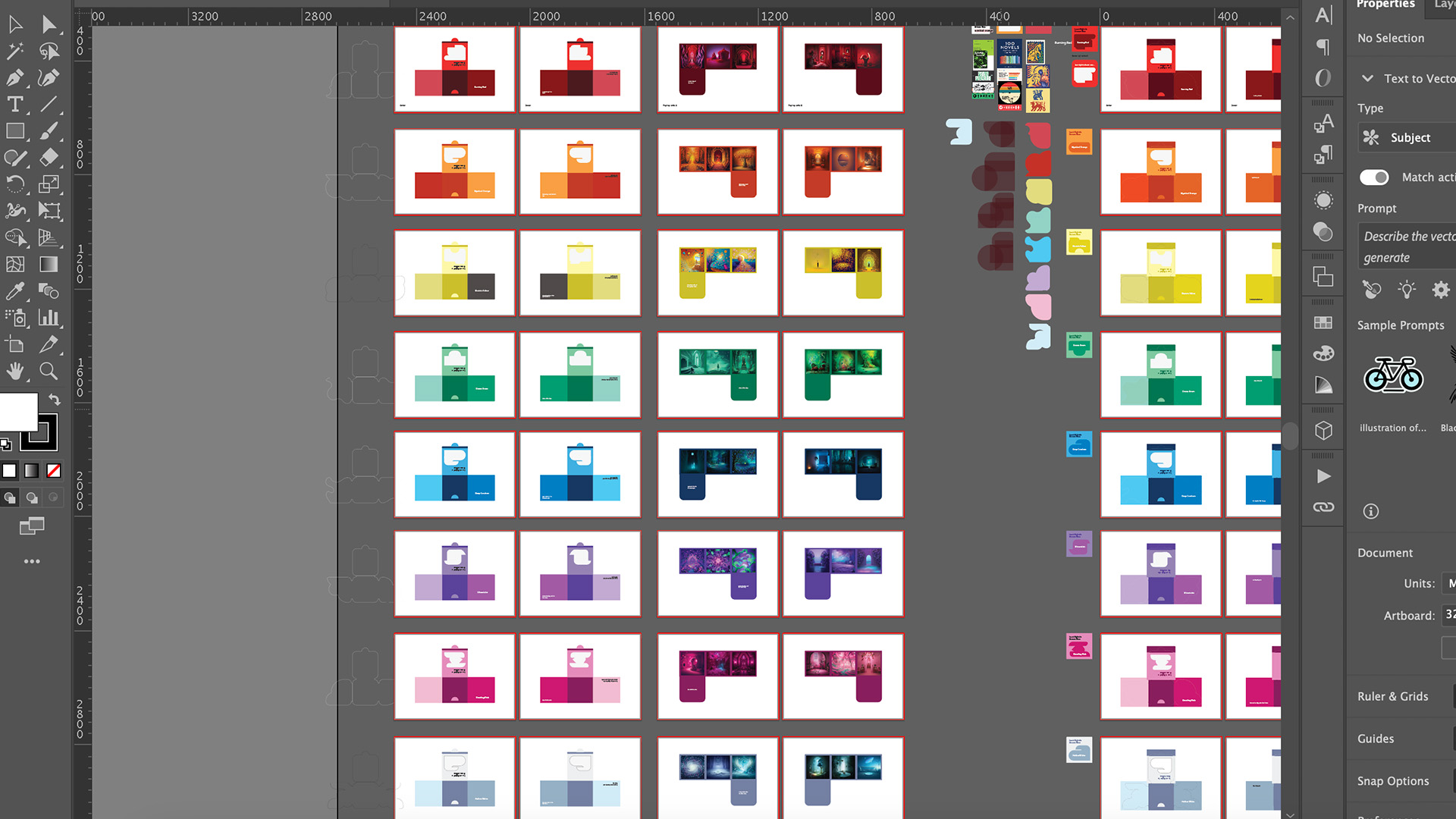
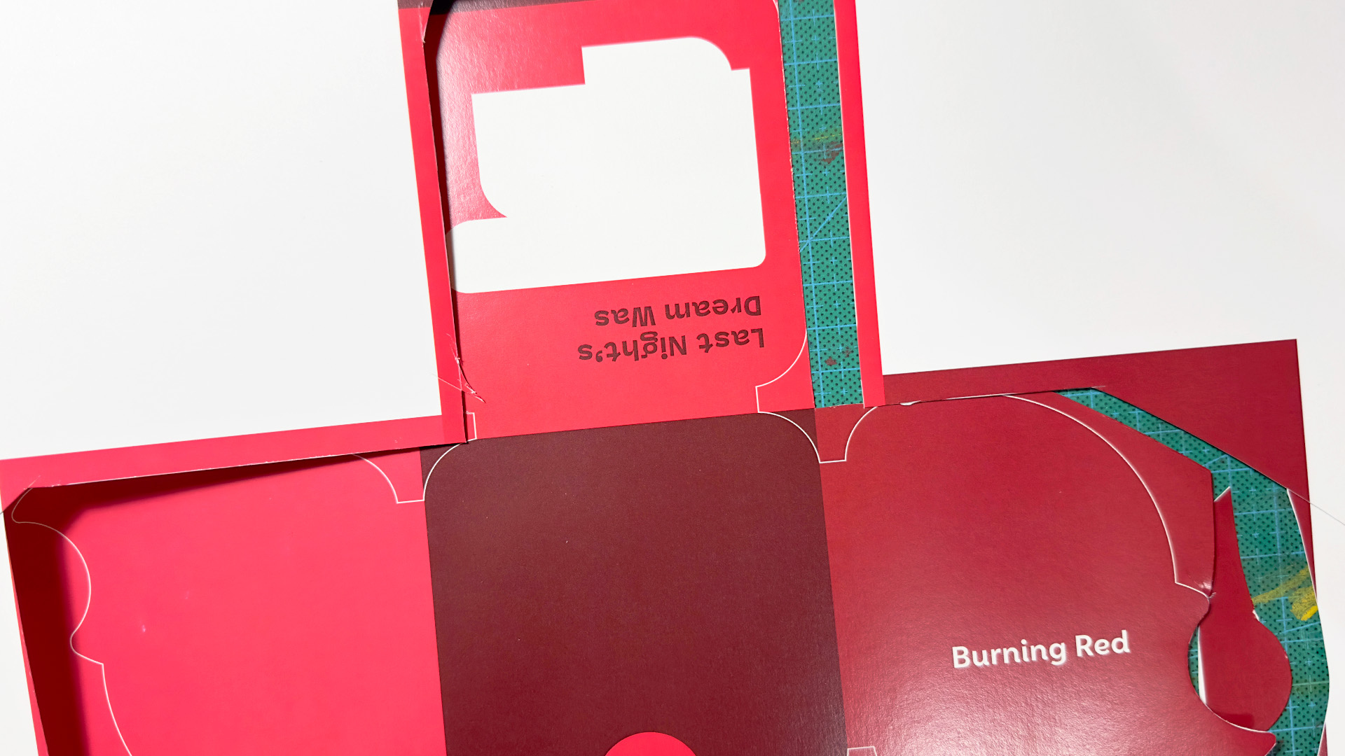
Within each publication features 6 AI visuals created by AI as inspired by the characteristics of various flowers; a foldout in itself that reveals the images in its setup. Each occupying square holds either a line verse in ponderance to the visual spaces, their represented flower species, and the coloured rooms themselves that make up the walls of the pop-up.
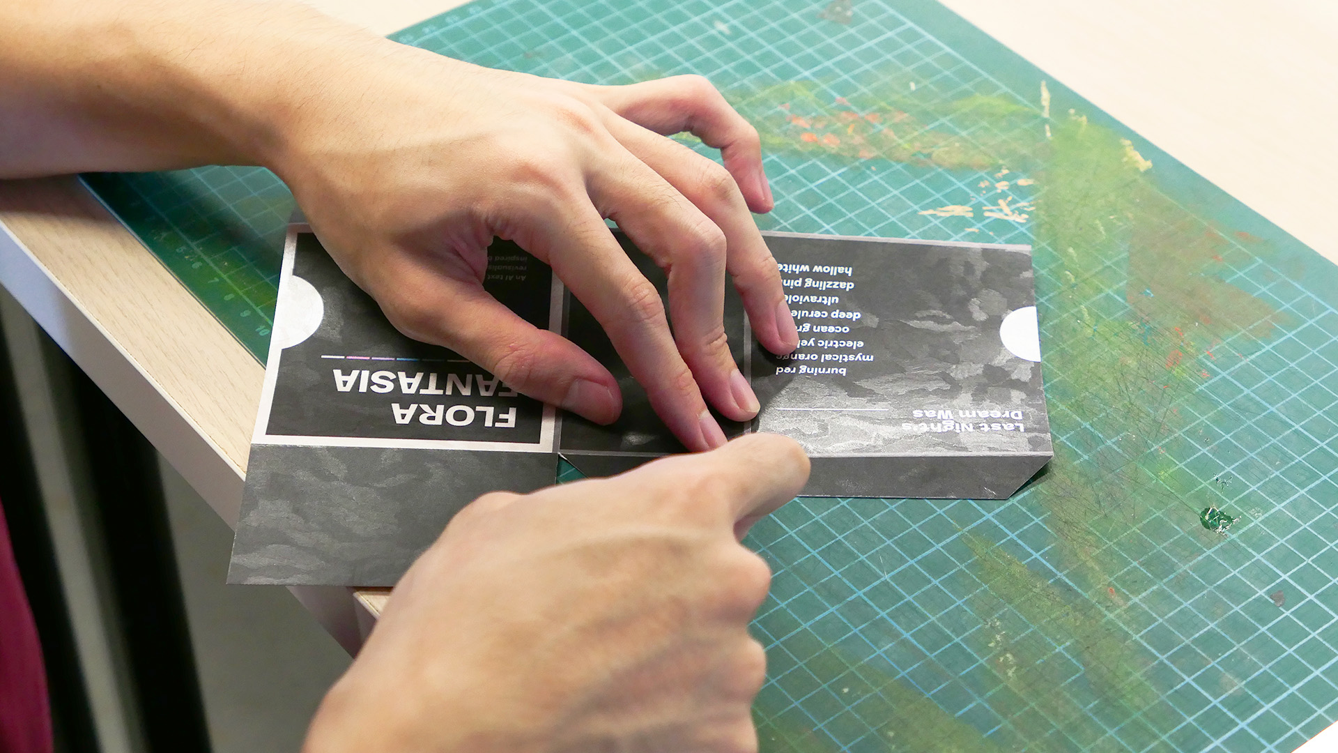
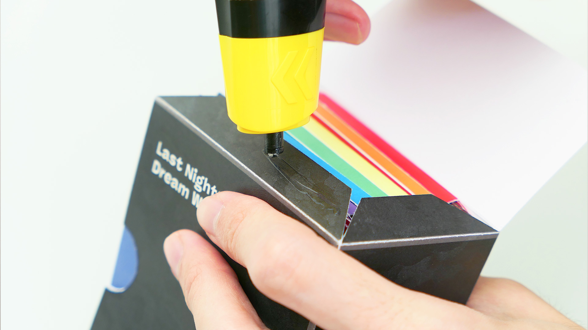
Each foldout is made of a paper stock of substantial weight, folding spines integrated into its craft so as to add volume to the collection as a whole, which is housed in a holding container that represents our publication series.
These design of the packaging and its print foldouts is reminiscent to that of Polaroid snapshots as part of the allusion to memory and recollection, of what peculiar and lifelike rooms created by AI allow the viewer’s imagination to live only within the space of a moment, spaces that they may only encounter to what a dream may show or reveal.
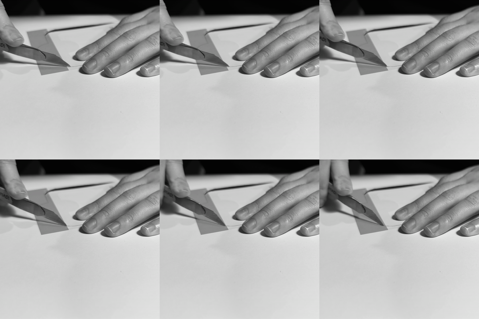
The front of each enclosed foldout contains a transparency window formed by abstract block letters spelling ‘FANTASIA’, as though beckoning viewers for a closer look, whereupon the unfolding and setting up of the inner pop-up just like forming the corners of the walls of a house, or perhaps, rather, the mere corners of our imagination, as surrounded by the open spaces of the floor plan of the foldout.
Feedback
After solidifying our project direction, we aimed to incorporate projection mapping into our
artefact. Following discussions with Andreas, it became apparent that our project lacked a clear
purpose, and the connection between our project and its potential to facilitate a stronger bond between
our target audience and nature was insufficient. In light of this feedback, we had to address several
key questions: Why is nature important to us? How do we personally relate to nature? In what ways do we
form a connection with nature? We then endeavoured to embed these considerations into our artefact,
ensuring that the audience's interactions with it would reflect these reflections.
Furthermore, Andreas pointed out that the visuals sourced from huggingface.co did not
effectively capture the essence of the flowers or facilitate a deeper understanding of their
characteristics.
Following the feedback received last week, we opted to transform our artefact into a publication,
aligning more seamlessly with our refined art direction and context. Gideon recommended approaching our
text prompts from a more surrealistic perspective, steering away from the overly realistic concept we
had initially. He proposed innovative ideas, such as crafting a surrealistic house inspired by the
flowers for the insects to inhabit, deviating from the conventional approach of a standard architectural
catalogue.
At that time, the book lacked engagement and interest. As a result, Andreas recommended a thorough
exploration of the publication's size, formats, materiality, and layout. Moreover, he encouraged us to
delve into categorization, urging us to analyse the different flower outcomes. This involved a deeper
examination of images to extract elements for categorization, considering aspects such as narrative,
interactivity, user experience, emotions, colour, inside and outside space, or small and big spaces.
Following our presentation, feedback emphasised that our context, objectives, and artefact
foundation are well-established. The focus now shifts to enhancing the artefact. Various suggestions
were provided, such as exploring alternative shapes instead of a square for the book, experimenting with
the pop-up fold-out section—considering options like a kaleidoscope or incorporating a "ceiling." There
was also the idea of narrowing down to three series instead of all eight.
Additionally, they proposed altering the cutouts and shapes of the books to abstract
representations of our flowers, integrating flower origins into the artefact design.
A philosophical question was recommended for discussion: Does using technology to foster a
connection with nature create a contradiction? This could provide a thought-provoking wrap-up for our
project.
Conclusion
In conclusion, this project improved our design and critical thinking skills. We also learn about the importance of the target audience and the importance of the audience’s experience with our artefact. Throughout this project, we mainly faced a lot of difficulties in coming up with a definite purpose and creating the link between our context and artefact.
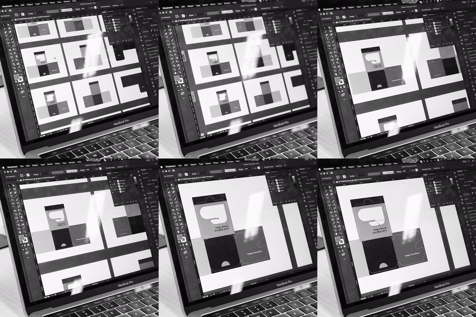
However, we managed to overcome it with the guidance of our lecturers. We also had to refine our publication layout a few times due to miscalculation of the measurements and folding directions, as well as trying to cut out the book as cleanly as possible due to the curves. Overall, we managed to overcome these challenges as a team and finished our project with an artefact that the whole team liked.
-andrea copy.jpeg)
